The making of 'Emotions' with Adobe 📷
In this blog, I will tell you about the development of my latest series called 'Emotions', and how I used the Adobe Creative Cloud Photography plan’s amazing tools to create these images. It contains the making of, and also tips on how I edit my pictures with Lightroom and Photoshop, developed by Adobe. Check out what the Adobe Creative Cloud Photography plan has to offer.
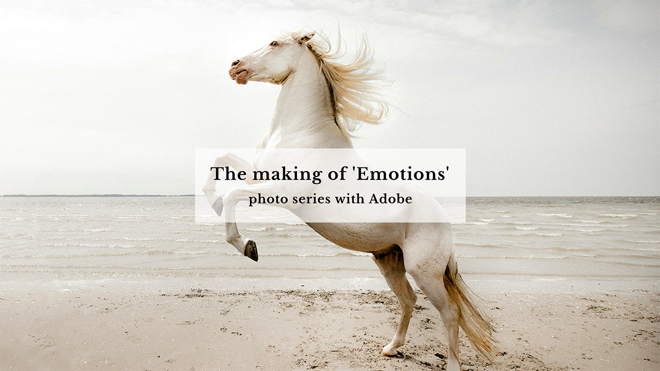
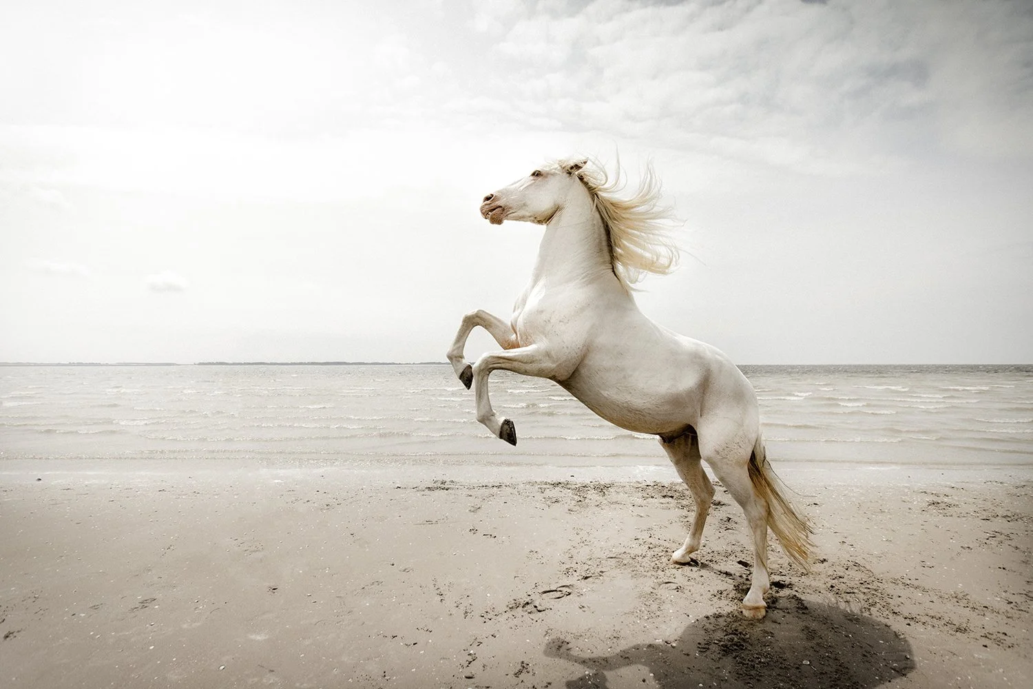
If you need Adobe’s Creative Cloud Photography tools, the Adobe Creative Cloud Photography plan is the right choice. It includes Photoshop, Lightroom, and other apps for creating and editing great images. I’m inspired by horses, their shapes, emotions, and noble looks. That inspired my latest photo series, "Emotions." I wanted a light, clear, yet strong feeling in a calm, empty place, so I chose the beach. To get a soft, pastel tone, I picked a white horse, matching the mood I wanted. The weather was perfect for the shoot.
I feel very lucky to have found someone with a beautiful white horse and they allowed this to be my subject for the pictures. I explained the concept to her and what I wanted to create, making her horse the perfect match.
The horse was a 13-year-old Lusitano breed with a cremello colour, originally from Portugal. He is called Xpto de Payres but the owner calls him Chippie for short, which is a lot easier to pronounce. :)
The campaign result image, skillfully edited and enhanced using Adobe software, showcases the final creative outcome.
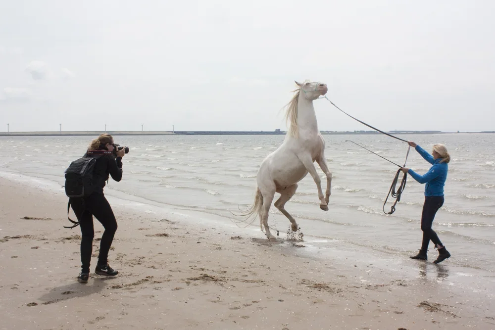
The making of... me in action. :)
We set off down a wooded path onto an empty beach. After waiting a short while for the horse to feel a little more comfortable in its new surroundings, we moved along the beach and selected an appropriate location, to start shooting. After a while, the horse started to show more confidence and its tricks and fluid movements become apparent.
I wanted to catch the horse completing a variety of movements and as I moved alongside it, I tried to capture some of its natural, beautiful appearance.
Being rather timid and apprehensive at first, Chippie didn't go into the water straight away, but when he did, it was great to watch him enjoy it, splash and move freely. The weather was perfect, with a subtle sky tone that wasn’t too contrasting, allowing me to solely focus on the horse.
When working on my images after a shoot, I always import them into Lightroom first. While doing so, I select a series of relevant keywords and basic settings such like lens corrections and metadata settings. After importing, I go through the process of selection to have a variety of images I intend to use. Once complete, I select a set of images I want to include in the final series. This is often the hardest part, as I always feel challenged to choose the best images, in a wide selection. Next I work on my basic edits, most of the time this can be fairly systematic, as I use a range of techniques often repeated in the same way.
Like I did with all of the images, I started off by using tools such as the white balance pipet and also the slides, in the basic adjustment section. This allowed me to adjust contrast, highlights and brightness. After that, I used the local adjustment tool to create a more dramatic effect on the light and to let the horse stand out more.
I used the local adjustment tool to decrease contrast and create brighter tones in certain areas of the image. (click to enlarge)
Once completed, I then opened the image in Photoshop. I generally use Lightroom for the biggest part of my photography organizing and editing, but when it comes to more detailed editing such as removing subjects, cloning and brushing, I prefer Photoshop.
For the shoot, the lady made sure the strap around the horse’s head would be as thin as possible, in order to allow me to delete it in a simple way. For this, I used the quick healing brush (J). It is easy to use and does the job in an effective way. I tend to use it in all my images and in this case, brush away the lady and the line. To finally complete, I used the stamp tool (S) in order to stamp the sand, where the girl once stood.
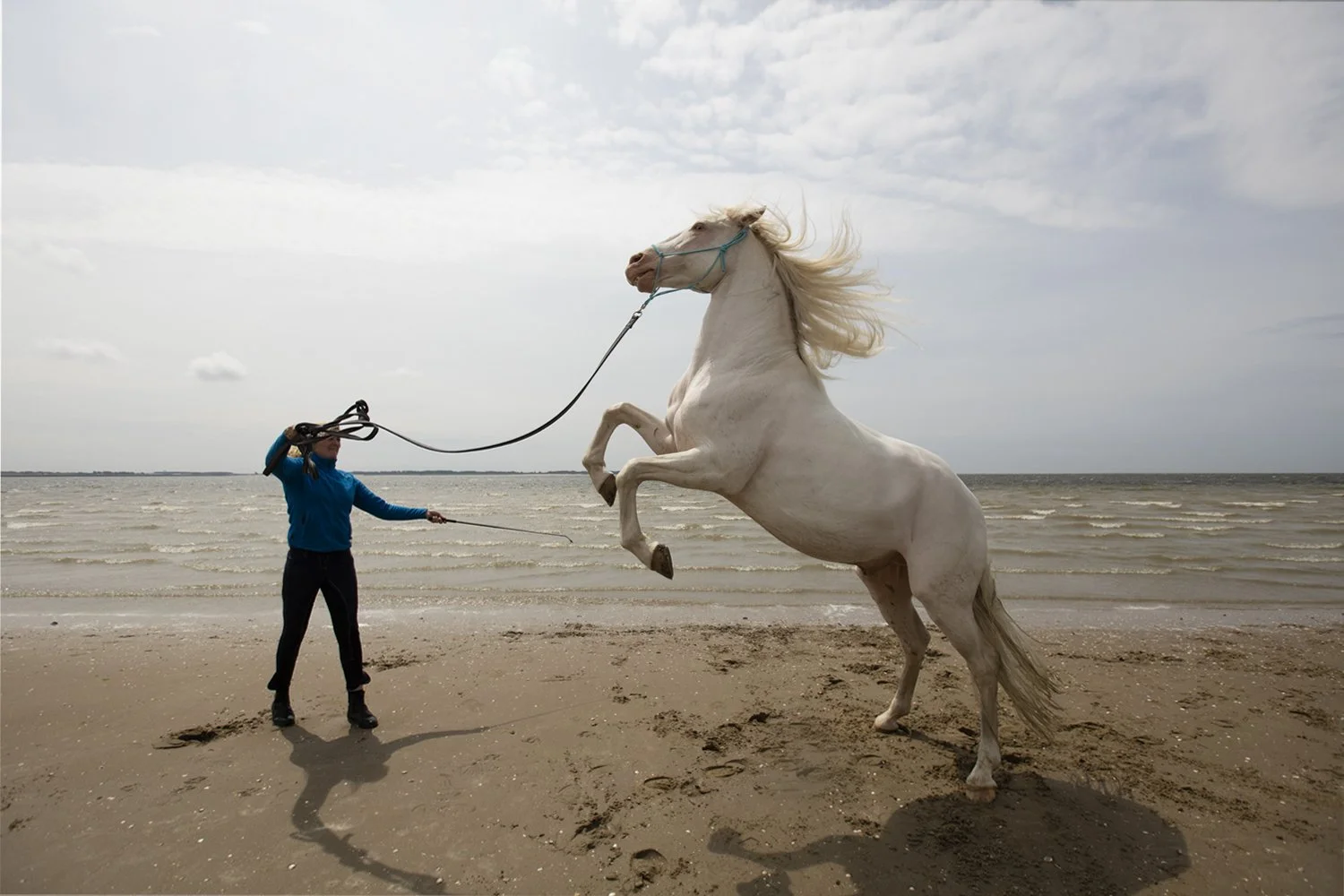
Before and after using the quick healing brush and stamp tool. (slide)
Finally, back in Lightroom I wanted the sky to be more contrasting. I used the gradient adjustment tool for this process and then dragged the sliders across, such as clarity and contrast. Eventually when all of the images were complete I wanted to achieve a similar look and feel, within all of the edited images. I did this by bringing the colours together in the same way and I lowered the saturation levels in the adjustment tool by using the sliders on the side. Thus resulting in appropriate tones, colours and contrasts.
Select the gradient adjustment tool and drag the selection you want to adjust with the sliders. (click to enlarge)
Check out the complete 'Emotions' series here.
This blogpost was written in Partnership with Adobe and created with Canon equipment. I want to extend a huge thank you to Adobe and Canon for allowing me to have this great opportunity to show how I used their amazing and creative editing tools. It shows creativity can develop in an inspiring way and anything is possible. All you have to do is explore and create your dream.
Discover more about the Adobe Creative Cloud Photography plan here.

